AI-assisted color planning for clean inks

Colorize line art online with AI

Upload a clean drawing, choose how much of the ink should be protected, and direct the palette, shading, lighting, and intended use. The generator creates a new flattened PNG on this page, so you can inspect whether the colors support the drawing before downloading or trying a more precise brief.

Source line art

PNG, JPG, or WebP · up to 5MB

0/600

Sign in to colorize

Generated color pass

One flattened PNG, not layered artwork

Your result appears here

Upload inks and choose the controls on the left.

Practical workflow

What AI line-art colorization changes

To colorize line art is to make a series of visual decisions that black ink deliberately leaves open: which regions belong to the same material, which colors identify the character, how values separate foreground from background, and where light changes a local color. A useful result is not simply a tinted sketch. It should preserve readable contours while assigning coherent color to skin, hair, costume, props, and environment. The selected color mode, line protection, lighting, use case, and written palette direction all guide the generated result.

Start with the cleanest source you have. A PNG is ideal when the drawing has crisp dark inks and an uncomplicated light ground, but JPG and WebP are also accepted. The upload can be up to 5MB. Crop away scanner edges, thumbnails, notes, and unrelated sketches. If the page contains a character and a detailed background, state whether both should be colored or whether the background should remain quiet. If two enclosed shapes touch, name their materials in the brief. For example: “navy wool coat, cream cotton shirt, copper buckle, auburn hair, pale green station walls.” Concrete nouns and relationships give the generator reviewable instructions; strings of mood adjectives do not.

The operation is generative, not a deterministic paint-bucket fill. The model sees the source image and creates a new rendered image that attempts to respect its structure. It may reinterpret faint construction lines, repair an ambiguous contour, merge small regions, or alter details. Maximum line protection asks it to retain nearly every deliberate ink mark, balanced protection allows limited cleanup, and flexible protection gives the rendering more room around minor sketch marks. None of these settings mathematically locks pixels. Compare the output against the source at the eyes, hands, costume seams, props, small symbols, panel edges, and any mark that carries story information.
Try these settings

Practical workflow

Keep clean linework while adding color

Linework is not one uniform thing. A silhouette contour defines the subject’s outer shape. Interior contours separate hair locks, clothing panels, fingers, and props. Hatching describes value or material. Construction marks may be accidental. A generator can protect these marks more reliably when the drawing has a clear visual hierarchy. Use dark, continuous final inks for information that must survive. Remove grey underdrawing when it should not be interpreted as texture. Close important shapes where practical, and avoid placing unrelated reference swatches over the art. If the source has colored pencil, blue-line construction, or screentone, mention whether those marks should remain, disappear, or guide the palette.

Choose maximum protection for finished character inks, emblem details, technical props, or a panel whose expressions and acting are already approved. Balanced protection suits a polished sketch that still contains a few overlaps or scanning artifacts. Flexible protection is more suitable for a loose concept where color mass and atmosphere matter more than every small stroke. Protection does not mean the result will place color on an invisible layer beneath untouched pixels. The returned file is a newly generated, flattened PNG. Zoom in and check whether important contours have become lighter, doubled, softened, or replaced. If they have, increase protection and simplify the palette brief before retrying.

A strong palette brief distinguishes local color from lighting. Local color is the object’s baseline identity: a red coat, brown skin, black hair, brass hardware. Lighting changes how those colors appear in the scene. If you only need a design reference, select flat colors with neutral light. This produces the clearest basis for comparing costume variations or sending a color key to an artist. If you need a finished-looking panel, choose cel or soft shading and name the light direction. Do not request sunset, neon fog, underwater light, and neutral reference colors in the same sentence. Decide whether the priority is unambiguous design information or dramatic atmosphere.

Try these settings
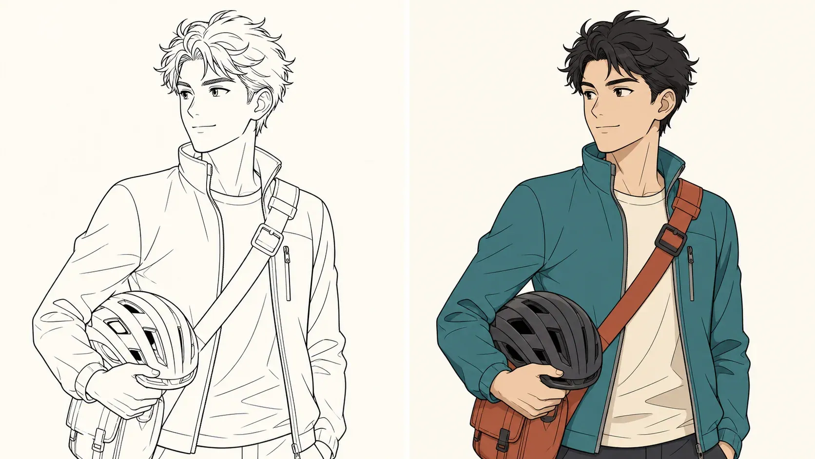
Original courier line art beside the same drawing with clean flat colors

Practical workflow

Color anime sketches and comic inks

Anime character sketches often depend on a small number of stable color decisions: hair mass, skin, eye color, main garment, accent garment, footwear, and one signature prop. Describe those elements before decorative effects. For a recurring character, save the successful palette in plain language and reuse the same names on later drawings. A generated image can help establish a color direction, but it does not create a formal model sheet or guarantee consistency across future poses. Use the result as a reference, then compare new images for hue drift, changed trim, left-right reversals, and accessories that disappear.

Comic panels need a different hierarchy. A panel may contain several figures, scenery, speech balloons, motion lines, and black shadow shapes. State which character is the focal subject and which areas should recede. Keep balloon interiors and lettering-safe areas light if lettering will be added later. Ask the generator to preserve panel borders and intentional solid blacks. If text is already present, generated lettering can become distorted, so a safer production workflow is to color art before final lettering or to replace all text after color review. This tool does not perform separations, trap colors for print, or return lettering as editable type.

This tool works best with one clean character drawing, illustration ink, or well-isolated comic panel. A complete manga page may still be accepted as an image, but small panels, screentones, balloon interiors, gutters, and existing lettering create more ambiguity. For dense pages, crop one panel at a time and treat the result as a color study rather than a finished page.

Try these settings
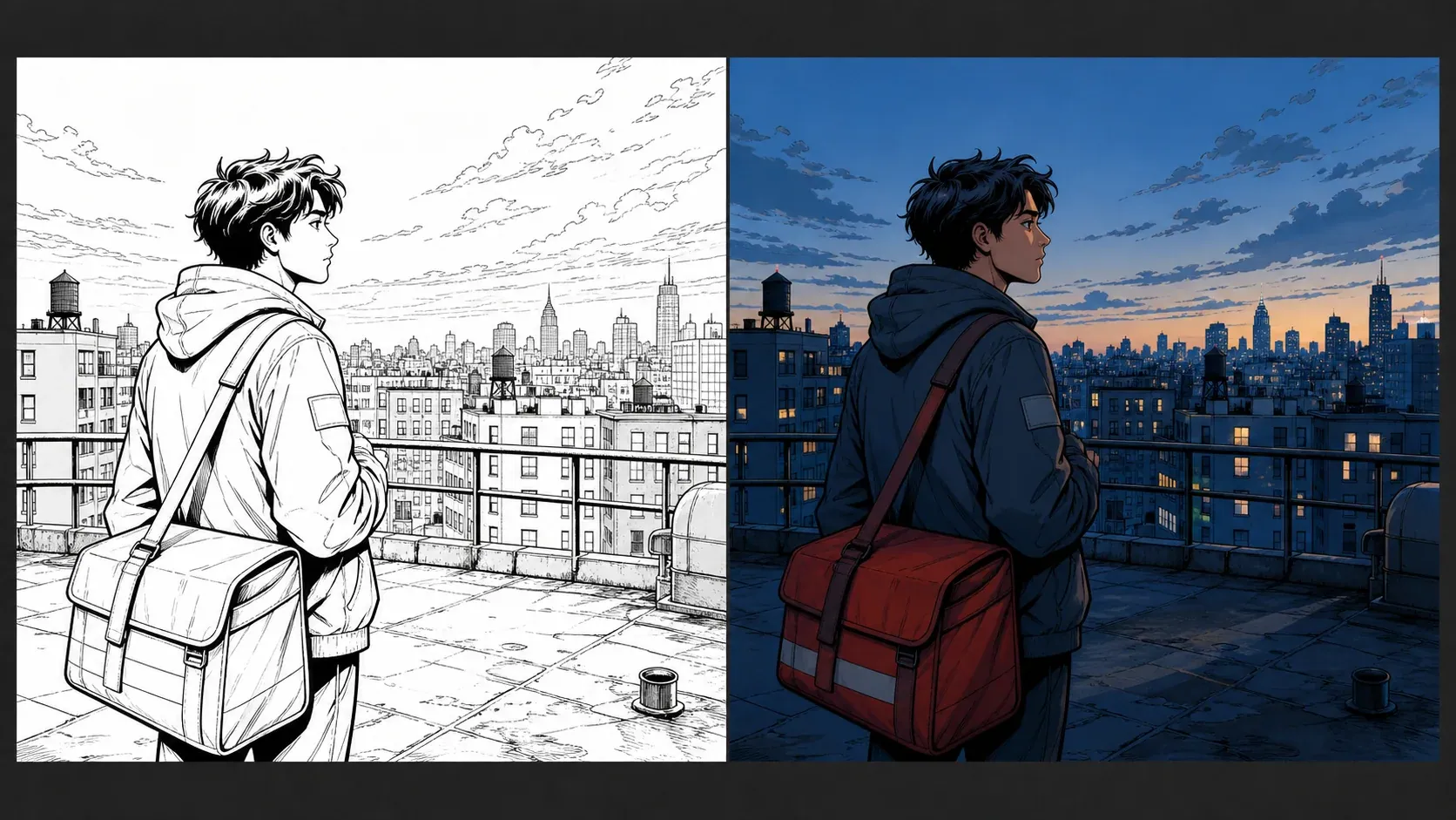
Rooftop comic ink scene beside a cool dusk color treatment with warm accents

Practical workflow

Choose flat colors, shading, and lighting

Flat colors are the most restrained option. They separate materials and establish a palette without asking the model to invent a complex light solution. Use them for character design, costume review, prop callouts, or a base reference for manual painting. Cel shading adds one or two crisp shadow families and suits animation-like characters or comic art with decisive shapes. Soft shading introduces gradual value changes and can help with rounded faces, cloth, or atmospheric illustration, but it can also reduce the graphic clarity of very thin inks. Cinematic color gives the model the broadest permission to use atmosphere, colored shadows, selective highlights, and depth; choose it when the scene mood matters more than a neutral palette record.

Lighting should support the chosen color mode. Neutral light keeps local colors legible. A warm key creates a clear directional source and cooler restrained shadows. Cool dusk shifts the environment toward blue while preserving small warm accents such as windows or practical lamps. Dramatic rim light outlines the subject against a darker field but can obscure interior colors if the source is already dense. Treat the menu as art direction, not a physical lighting simulator. The model can place a highlight inconsistently or light different objects from conflicting directions. Review cast-shadow logic, face readability, silhouette separation, and whether the focal subject remains the highest-information area.

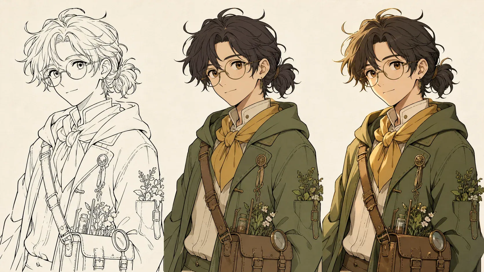
The three-stage example shows why it helps to decide the deliverable before generating. The first image is only ink and provides no color assumptions. The second establishes local colors. The third keeps those colors but adds a warm key and controlled shadow shapes. In practice, generated stages may not be pixel-identical because each job creates a new image. If exact continuity between a flat pass and a shaded pass is essential, use the generated flat version as a reference in a dedicated editor and paint or shade manually. This page currently accepts one source upload per job and returns one flattened PNG, not an editable sequence of linked passes.

Try these settings
The same botanist line art shown as inks, flat colors, and warm cel shading

Practical workflow

Prepare line art that is easier to color

Scan or export at a size where the important contours remain visible after the image is fitted into a square generation canvas. Extremely thin pale lines can disappear; extremely thick black masses can be read as filled objects. Remove dust, page shadows, crop marks, and paper texture unless they are part of the intended style. Keep the drawing upright. If the background should remain uncolored, say so. For layered clothing, name the order and materials: “cream shirt beneath a moss jacket, brown strap over the jacket.”

Use the prompt field for palette, materials, focal hierarchy, and visible constraints. A practical brief might read: “warm medium skin, dark auburn hair, moss green field jacket, ochre scarf, weathered brown leather bag; keep the background warm off-white.” Do not request Photoshop layers, spot-color channels, vector paths, animation-ready cels, or exact Pantone output because the result is a flattened raster image. A hex color can provide direction, but it is not a color-accuracy guarantee.

Only upload drawings you own or have permission to process. Remove private notes, client information, signatures, or reference material that should not be included in an image-generation request. Do not use a generated color pass to hide another artist’s ownership mark. For commercial work, inspect the source rights, service terms, result details, and final production requirements before publication.

Before sending a drawing into a shared production review, record the source filename, selected controls, palette brief, and the purpose of the test. That small note prevents an attractive experiment from being mistaken for an approved color model. If several collaborators are comparing versions, name the practical difference between them: neutral flats for costume approval, warm cel light for an interior panel, or cool dusk for an exterior sequence. Avoid judging versions only by overall polish. Check whether the character still reads at the final panel size, whether recurring materials keep the agreed hue family, and whether a background color competes with dialogue. A clear review note also makes manual follow-up faster because the colorist knows which generated choices are intentional, which are provisional, and which source lines must be restored exactly.

Try these settings

Practical workflow

Review, retry, and hand off the result

Review at two scales. At thumbnail size, ask whether the focal subject is clear, the palette has a useful hierarchy, and adjacent shapes separate. At 100 percent, inspect eyes, fingers, hair gaps, costume seams, tiny props, line intersections, and edge halos. Look for colors leaking across contours, skin color assigned to clothing, shadow shapes that contradict the drawing, and background light that changes the intended time of day. A result can be attractive while still being wrong for the story. Use the source drawing as the acceptance reference, not only the apparent polish of the generated image.

When retrying, change one source of ambiguity at a time. Increase line protection if contours drift. Switch to flat colors if the lighting overwhelms the design. Shorten a crowded palette brief into a list of subject, garment, prop, and background colors. Crop to one panel if a page is too dense. Clean construction lines in the source if they are being colored as objects. Keeping each change isolated helps you learn which instruction affected the result and gives collaborators a defensible reason for choosing one version over another.

The downloaded file is a flattened PNG suitable for visual review, a mood board, a character color reference, a pitch draft, or further raster editing. It is not a layered PSD, vector file, print separation, transparent character cutout, or guaranteed final comic asset. If you need editable production layers, import the PNG and source inks into your drawing application, place the inks above manual color layers, sample only the approved palette choices, and rebuild regions that need exact control. That handoff preserves the speed of AI exploration without confusing a generated preview with a structured production file.

Try these settings

Line art colorizer questions

Can AI color line art without changing the lines?

The protection control asks the generator to preserve deliberate contours, but this is generative image editing rather than pixel locking. Always compare the returned PNG with the source and retry or edit manually when an important line changes.

What file formats can I upload?

You can upload one PNG, JPG, or WebP image up to 5MB. Clean, high-contrast inks with little scanner noise are easier to interpret than faint construction sketches.

Does the download include layers or a PSD?

No. The tool returns one flattened PNG. It does not provide separated inks, flats, shadows, highlights, vector paths, or a layered PSD.

Should I choose flat colors or cel shading?

Choose flat colors when you need an unambiguous character palette or a base reference. Choose cel shading when you want crisp animation-like shadow shapes and already know the intended light direction.